Involvement
Thanks to a mutual friend, I was contacted by Stinger about doing a website for them.
It sounded like a wonderful opportunity! Stinger Welding, INC is a company based in Coolidge, AZ. that actually makes bridges for Phoenix and 6 other states including Arizona. I've seen their work first hand, as they actually erected a bridge in one day on I-17 between Glendale & Bethany Home. It was quite a pretty bridge! I said to myself, "these folks won't be accepting less than excellence from their employees."I gotta show them what I'm worth.
Upon meeting the boss, the point was clear that he was "looking for shock value." Fortunately, I'm pretty skilled in that field. He was also looking for somebody who knows marketing, and had a good sense of design. Boy, this was right up my alley! He had given me an example of what he was talking about when it came to marketing. A competitor had created 2 refrigerator magnets using their company's logo, sitting upon a plate of actual metal! The metal was as thin as a CD, but the size of a small Game-Boy. Its weight was something serious... but it managed to catch the attention of the boss. He somewhat marveled at it, and contemplated something better for his company. I decided to solve these problems and upon getting home that night, I studied the competition's web pages to see what they were offering. Each competitor killed the current design Stinger had. It seemed I had quite a challenge ahead of me. The next day, I woke up early and went straight to work.
I focused on the areas I felt needed the most attention:
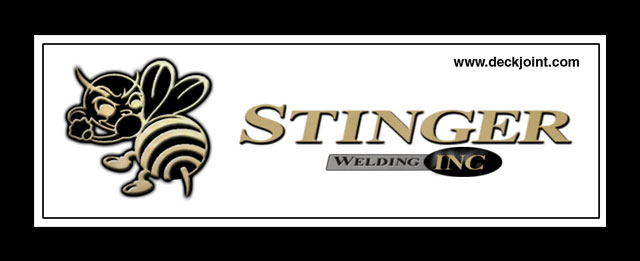
Logo:
The cutesy cartoon bee was actually a fine design, however, the color scheme had limited uses. We had to expand the horizon of the logo, bring it to the 21st century with a make-over, while retaining its original design (b). With the new logo, the rest was going to fall into place incredibly easier... especially the website, which needed to match the quality of its competition. Plus, anyone looking at the new logo would've taken them much more professionally, which is definitely a plus.
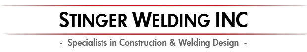
The Website:
What was there before was incomplete, and focused too much on "glitz and sparkles." In other words, you must have a cake before you add the icing, to which the website was short of "cake." With the site unfinished it was basically useless as well. HUGE problem when you're a big company like this. I had a good idea of what a construction company needed on their website. The use of metallic colors were a good start for the website. I constructed the website using the new logo, knowing that the shock factor was going to be high.
"Stinger Welding, INC." Website
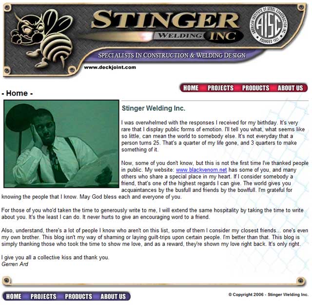 |
(above) Concept for the "Stinger Welding, INC." Website (2006)
|
Business Card:
We needed to keep continuity throughout this project, so this involved a new business card as well... a professional-looking one (c). I constructed it up, and printed out a sample. It looked magnificent... a kind of card you would be proud to whip out on a client... at least in my opinion.
Brochure:
A brochure was mentioned in the meeting as well, so I decided to spend some time creating a layout for a potential brochure using lighter, friendlier colors to appeal to a larger audience. The brochure was the last item I worked on and didn't include a lot of the ideas I wanted to produce. I tried hard to keep my work hours under 40 just in case this fell through... so the brochure didn't receive a lot of my attention. It was passable, but not of my standards.
"Stinger" Brochure
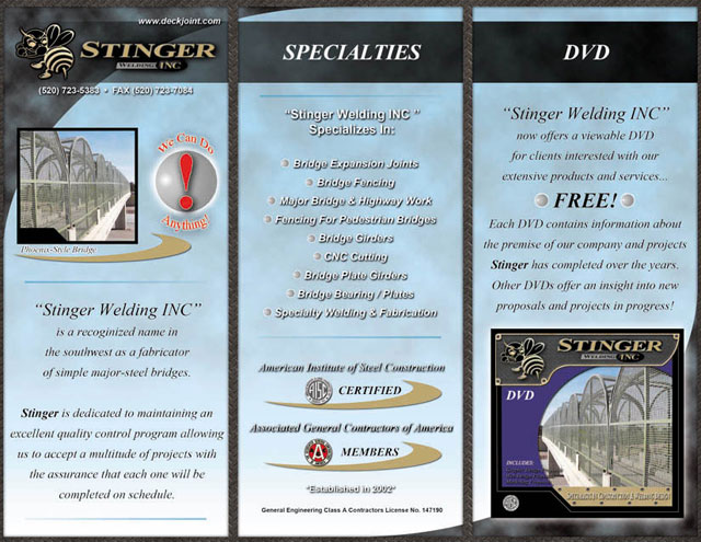 |
(above) Concept for the "Stinger Welding, INC." Brochure (2006)
|
DVD Case:
This was the answer to the refrigerator magnet! How many companies like Stinger could produce a DVD like this (a)? I'm sure it hasn't been done quite to this degree. This would make Stinger Welding the envy of this construction region. It says a lot, and the design of the DVD case, which was a stand-alone case, no plastic holders, was impressive to say the least. It matched the new design of the webpage and had a nice feel to it. It looked as if it was created by a major-player in the industry... and that's the feel I was looking for.
DVD Content:
The content on the disc itself contained 2 minutes of how we were going to obtain the upper hand in the industry, and become the new trend-setters. The competitors would've taken some serious notice of us. Basically, I threw together a presentation to the tune of Teena Marie, better than your average PowerPoint presentation, and to the point. It showed where we were, and showed where we could go. The boss wanted the "shock factor," and this was showing him how we can achieve it.
Unfortunately, the website never left the ground floor. The company fell flat in the following years, and it took another 5 years for them to create a professional website.
In 2012, the owner, Carl Douglas, was killed in a plane crash.
Visit the 2013 official "Stinger Welding INC." website at:
www.deckjoint.com
|
|
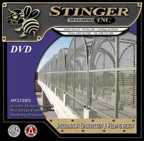
(a) Newly designed DVD Case
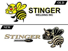
(b) Re-designed Logo
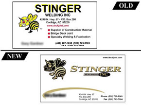
(c) Re-designed Business Card
|